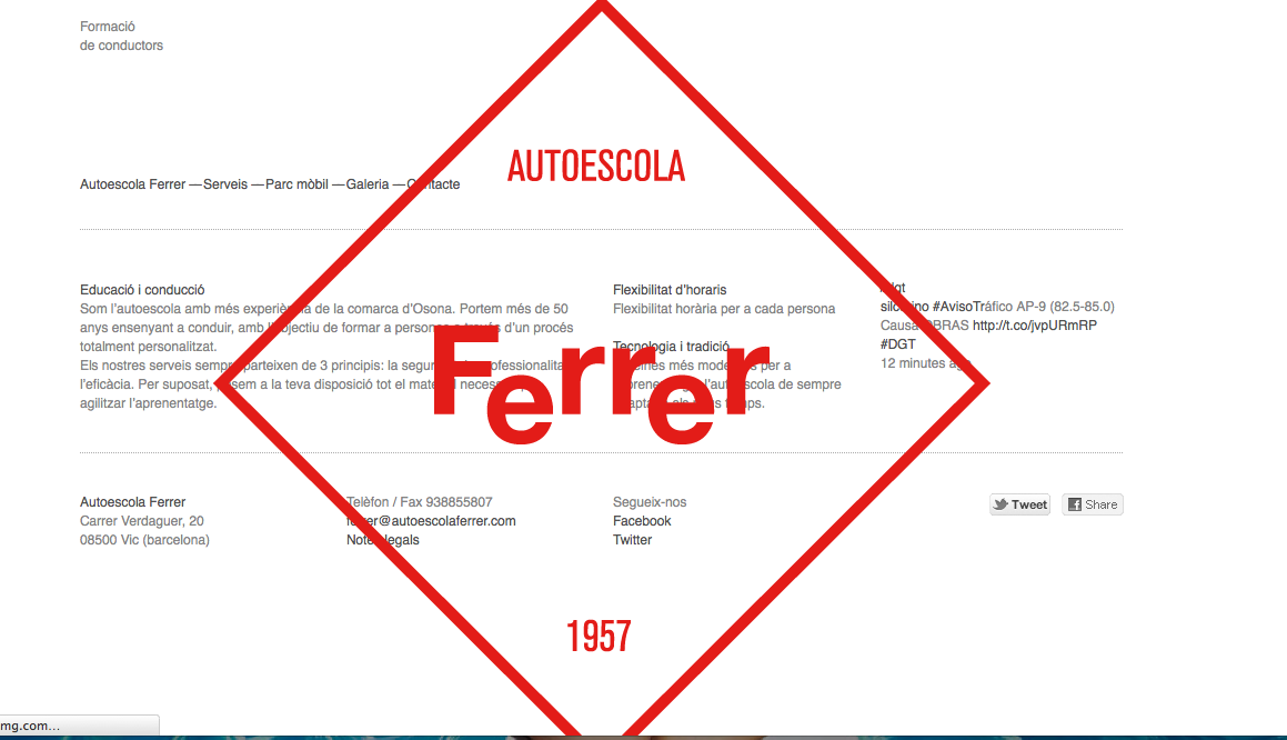
Thursday 27 September 2012

Fred Collect - Print Based Branding and Identity

Autoescola Ferrer
http://bisgrafic.net
  
This is the homepage for Autoscola Ferrer. This is really cool to, I think the overlapped diamond works well.  


A Well Respected Man / Visual Design & Art Direction
http://awellrespectedman.com/ 


 http://awellrespectedman.com/


Timur Salikhov.
http://www.timursalikhov.com/
I am a 31-year old art director & graphic designer based
in Saint-Petersburg, Russia.  

Naked beer is just a concept at the moment but I will defiantly be trying the real product.


 Richie Stewart 
http://portfolio.commonerinc.com/
'Rat City'
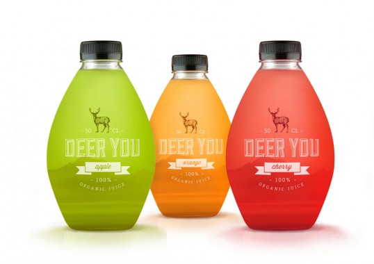
I have a fascination with green glass. This might not look high cultured in fact it looks grimy. Its called Sucker Punch! Love it. Probably tastes awful too.


Richie Stewart 
'Fast Eddie's'


 Studio Wicked

Freds Collect - Print Based Packaging

This is some branding by Handcrafted:
http://www.heathernguyen.ca/

Nobel Handcrafted is a brand that embraces the collaboration of craft with the pioneering of our new American food tradition, a tradition that is being continually refined.”


Designed by Permafrost | Country: Norway
http://permafrost-news.com/# 

I'm just fascinated with graphics on glass or bottles. I think print directly onto the product looks so much neater then on a vinyl. In fact this probably is some kind of clear vinyl but it doesn't look like it.


PostlerFerguson
http://www.postlerferguson.com

This is a rad design and I would probably buy it just for it to stay in my fridge on show; I think that real fish enthusiasts and sea food connoisseur may be put off as they cant see the fish. I know my dad who's a chef like to browse the seafood and have a good look and thoroughly examine the fish before he's purchasing anything. Just a thought.
 
PF's website is pretty neat to. Love the primary colours on the website.


Designed by Anders Drage | Country: Norway
http://dribbble.com/andersdrage


Designed by Mara Rodriguez | Country: United States
http://i-m.co/oloramara/oloramara/packaging

"The brand as an stamp, tries to give quality to the product, but with a nowadays style, cause we don’t want it to be an old fashion juice. Also the mountains on the background gives to Deer You Organic Juice a different and attractive feeling. The bottle tries to represent a canteen bottle, which people used to carry to adventure trips, or to a cabin in the middle of nowhere, so it help us to transport our minds to a fresher air place.”
 

 Kevin Angeloni
"Another way of seeing the gray pencil that everyone knows and is an indispensable tool for all creatives. The pencil is contained in a thin glass cylinder topped with a cork. Everything is placed in a plexiglass holder."
Cool but I see it as a lot of unnecessary packaging.


Frusionby ~designslave (Deviantart)
Designs & Interfaces / Packaging 

Again this visually looks great, eyes and the cute little box... but whats the point. Seriously, packaging fruit to the extreme. Fruit shouldn't need selling! Fruit is amazing anyway. F*ck off.