I think I preferred giving feedback and evaluation having the work in front of me personally and answering a set of questions about the work privately. I think it makes it easier to be honest and the results are usually more genuine and reliable. Although I do think group crits where everyone discusses the work is necessary too as ideas are generated this way I find.
The feedback to my work.
I received two individual pieces of feedback. I am happy with the feedback I received and generally think the point raised are valid. General points:
- Anchor the text only poster with the other too more - Use of colour (more orange)
- Image only poster - Sharper print. I knew this needed adjusting before I submitted it for the crit but I must of accidentally opened the original poster canvas in 72dpi and continued to work on it until it was finished; when I came to print it the morning before I realised the mistake and by that time it was too late and I did my best to make it sharp with the time I had in hand.
- I should of also put the proverb on one of the posters as this would of made the message obvious, for some strange reason I didn't?
I am quite happy with the results, although the points raised seem obvious now but without the crit I couldn't see the problems. I think the whole visual concept worked well and even though my message wasn't on any of the posters the two people who critiqued my work were more then on the same line as my proverb 'don't judge a book by its cover'
I have enjoyed this task and it was nice to create the posters from scratch with the freedom to try new things.
Saturday 29 October 2011
Friday 21 October 2011
What is a Critique?
- Form of assessment, chance to get feedback
- Chance to put your opinion across
- Allows persons(s) to improve
- Generate some ideas
- Non - judge - mental
- To make sure you are working productively, discipline, time management.
When trying to analyze a piece of work it might be helpful to use - DIET:
Describing, Interpreting, Evaluating, Theory
Questions to ask when looking at a piece of work:
How was this made?
Where would you find it?
Was it commissioned?
Will this poster be international?
Who is the audience?
Wednesday 19 October 2011
Street Art/Graffiti - Lecture 3

At the site of the one of the world’s oldest art exhibits, at Lascaux,
France, we can see Man’s early success at Wall-Art. Drawn nearly 20,000
years ago, this work still makes us stop walking and take notice;
something all Graffiti artists strive to accomplish today. The early
artists who created the works in these caves couldn’t possibly have
known what they had become a part of, and the legacy they left behind,
though lost for countless centuries, would be discovered again and
treasured beyond all others. Their work is our birthright.
The Formative Years

Once Man discovered his ability to modify his surroundings, art began to
cover cave-walls and rocks all over the world. Even so, despite Man’s
penchant for progress, graffiti was slow to evolve during its first
several thousand years of its early existence. While amazing displays in
their own right, it would still be ages before the human qualities of humor, lust, and rivalry begin to work their way into the budding art-world.
Adolescence

It seems true of any subject in any era, that with time comes comfort
and with comfort comes complacency. The Dark Age’s affects were not
limited to daily life, education, research and freedom. Art and its
front-line manifestation of the urban populace, graffiti, suffered as
well; during this period it seems as though people simply stopped
trying. Graffiti degraded to simply marking names over other artists’
work, usually in foreign countries freshly invaded. The occasional,
humorously lewd depiction of sexual escapades could be found from time
to time, such as the above drawing from a castle in Bulgaria, but for
the most part graffiti as we know it today lay dormant throughout the
period. It would be another 200 years before the first semblance of
modern Street-Art would begin to appear.
http://weburbanist.com/2009/04/22/roots-and-history-of-modern-street-art-and-graffiti/
Modern day graffiti as we know it started in New York City.
Graffiti. Artists chose names, or "tags", that were short, easy, and
could be written quickly. Many early taggers chose names that
represented what part of the city they came from. Such was the case for
Taki 183, from 183rd street in Washington Heights, Manhattan. Taki 183
is credited as being the first tagger in New York City. Taki was a foot
messenger and being on the subway, he put his name along the trains and
streets during his travels across the city. A 1971 New York Times
article titled "Taki 183 Spawns Pen Pals" was referring to the growing
number of people who, like Taki, chose to mark their territory with
names like Stay High 149, Phase 2, Cay 161 and Joe 182.
Tags
quickly became more elaborate as writers tried to make their letters
stand out from others. Competition grew as "getting up" became the most
important thing a writer could do. The more places you tagged, the more
people saw your name, the more famous you became. Tags soon gave way to
"bombing" or covering an entire wall or door or any area with tags. In
1972 an artist known as Super Kool 223 is known to create the first
masterpiece or "piece" as it would be known. The piece was more than
just a tag, it included an outline, a fill in, shadows, and effects of
clouds, sparkles or shapes around the outside or inside the letters. The
piece was multicolored and took much longer to create, however it was
much more visible thus giving the artist much more exposure.
Artists would break into the train yards where the New York City
Metropolitain Transit Authority parked their subways and cover the train
cars with elaborate pieces. This is where bombing is said to have been
perfected as the usually unguarded trains would soon become rolling
exhibits of artist's work that would be displayed to millions of people
as the trains rolled through the city's subway stations. This is also
where the use of spray paint became a must for artists who would do
"whole cars" and "top to bottoms" covering the whole train cars with
their name. The new goal for a writer was to have his or her work go
"all city" and be seen in all five boroughs of New York City.
In
1979 Fab Five Freddy, a rapper, and Lee Quinones, a graffiti artist,
had their works displayed at a gallery opening in Rome. Lee displayed
many different works of art by both himself and other famous New York
City graffiti artists. This was the first mainstream exposure that
Europe had gotten to the new art form. England had its own underground
graffiti scene that mostly done by punk rockers and their fans in
London, but the rest of Europe had seen very little of this emerging
movement that was taking New York City and the rest of the US by storm.
Tags and pieces soon became common sights in cities like London, Paris,
Amsterdam, Rome and Oslo.
During the 1980's with the graffiti
movement in full swing, the government started to crackdown on illegal
tagging and bombing. The crack epidemic had made the streets much more
dangerous and graffiti was seen as a nuisance. The Metropolitan Transit
Authority in New York City began to clean their train cars thoroughly,
making it nearly pointless to do any type of graffiti on them since the
public would never see the pieces. Authorities actively seeked graffiti
artists, guarding areas that were more prone to graffiti and increased
penalties for those caught writing. Many graffiti artists however, chose
to take the changes as a challenge rather than a reason to stop.
Bombing in the subways gave way to aggressive bombing in the streets by
die hard writers such as BG 183, Blade, Dondi, Cope2 and Skeme. Many
artists found that getting up in their own neighborhoods would lead them
to be caught easier so they traveled to other areas of the city to
write.
Through the late 1980's and early 90's the graffiti
movement spread like wildfire both nationwide and worldwide. In Los
Angeles, Mexican American muralists incorporated graffiti into their
artwork, producing some of the most intense street art in the country.
Street gangs in Chicago, Dallas
and many other cities nationwide use graffiti to mark territory and
threaten rival gang members. In Europe and Asia where hip hop culture
had become just as big as in the US, graffiti artists were bombing the
trains and walls of nearly every major city.
Today, graffiti is
becoming more of an accepted art form in many ways. While stronger laws
and more effective cleaning methods have made it harder than ever to get
up these days, an underground scene still flourishes around the US, as
well as the rest of the world. Graffiti is on display in the Brooklyn
Museum of Art, where writers from the 70's and 80's such as Futura 2000,
Lady Pink, Crash and Daze are featured. Designers such as Marc Ecko and
PNB Nation use graffiti in their logos and on their clothing lines. And
legal murals can be found in many inner city neighborhoods. In New York
City the TATS Cru has murals all over the city in memory of deceased
famous people such as Notorious BIG, Big Pun, Tito Puente Princess Diana
and Mother Theresa. Graffiti is so much more than an illegal form of
art. Graffiti has become an important part of pop culture, and a well
respected form of art.
http://voices.yahoo.com/graffiti-street-art-brief-history-755363.html?cat=16
Example of Graffiti today:
Boa
Mistura - Perspective typography. I really want to do this somewhere
and so does Sam Lane. We will get around to doing it soon.


Keith Haring - artist
and social activist whose work responded to the New York City street
culture of the 1980s. He focused on graffiti using marker pens and spray
paint.
'Art Is Power'

'Portrait of Andy Warhol' 1989

Monday 17 October 2011
Results from Final Crit
I feel I now have a better understanding of how typagraphy works. Personally I know that my typeface needs tweeking. The footsteps underneath the letters need to be bigger as they are not very legible from a distance. Although I wanted them to be subtle they need to be legible. I got generally positive feedback apart from that the footprint suggestion.
I feel as a presentation I did well especially as I thought I would struggle when talking in front of the other 13 people. I still need to improve my confidence when speaking to large groups. Hopefully this will come with time.
I think I am going to make a few changes to my type before I submit it to be assessed.
Context of Practice - Lecture 2 (12.10.11) - Post-Modernism
2 - Post-Modernism


This is the hand out we got given at the start if the session with the definition of Postmodernism.


Again I enjoyed the lecture Richard gave. Interesting and I now understand postmodernism better then when I entered the lecture. Sweet.
Some Post-Modern examples:
Do not be satisfied

Bose 30
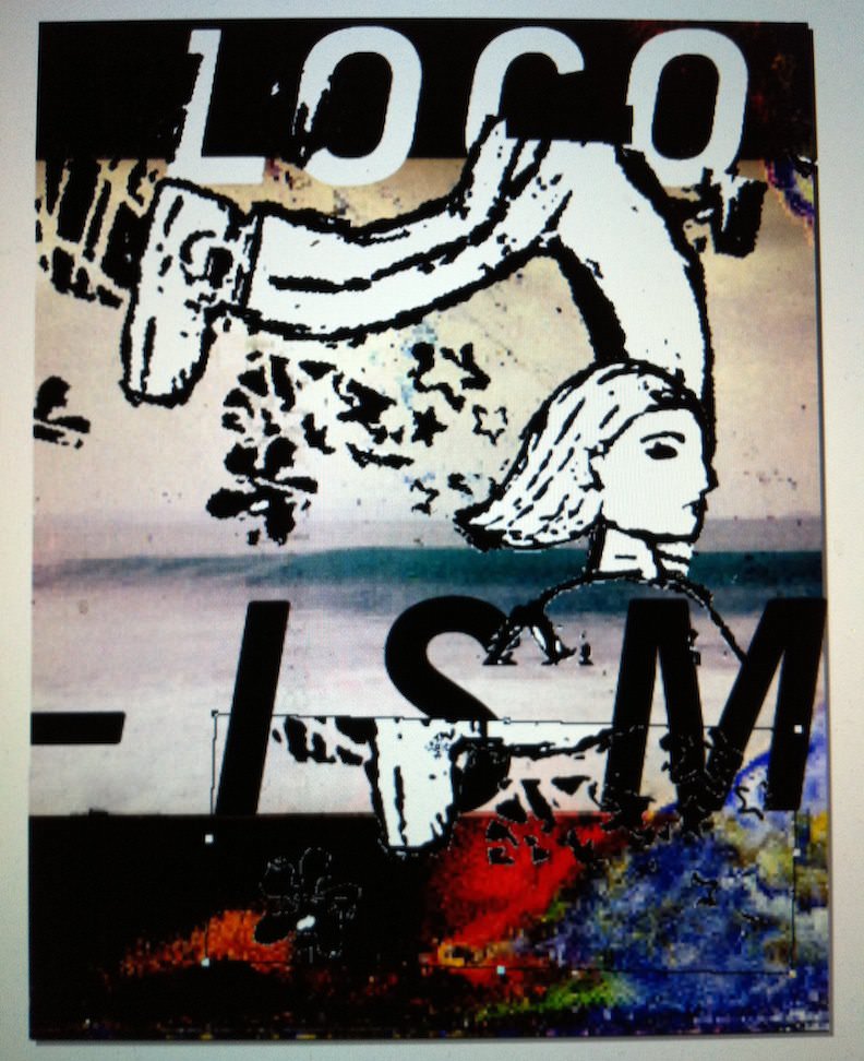
Locoism - Metropolis
http://www.davidcarsondesign.com/
Monday 10 October 2011
Graphic Design on Tshirts within Fashion


If your design is picked on Threadless the prize is $2000 and a $500 voucher to spend on Threadless which you can trade for $200. I think this is a great incentive to get people designing and also to actually submit designs. I might have to submit something soon.
Sunday 9 October 2011
Context of Practice - Lecture 1 (5.10.11) - Modernism
1 - Modernity & Modernism
- 'Modern', 'Modernity'
- Modernity - Industrialisation. Urbanisation - The City
- Modern Artists' response to the city


- 'Modern', 'Modernity'
- Modernity - Industrialisation. Urbanisation - The City
- Modern Artists' response to the city


The handout we received:
Modernity and Modernism Richard Miles, 2011
1.
‘Modern’
as a term is important to explore for the reason that it has become
ingrained in the cultural consciousness, popularised and
institutionalised (take for example the popular awareness this
country has for such an institution as Tate
Modern).
The word ‘modern’ has received usage in English from the 16th
C. By the mid 19th
C. the term meant ‘contemporary’, thus, between 1843-1860, John
Ruskin in his volume of writings ‘Modern
Painters’,
was really using the term to refer to painters of the day, such as
Pre~Raphaelites, who we today would not consider to be ‘modern
artists’. However, by the end of the 19th
C. and into the early 20th
C., the term ‘modern’ began to take on a flavour of something
‘improved’, ‘better than before’. This 20th
C. meaning of ‘modern’ as something ‘improved’ is
inextricably linked to a modern
consumer culture
in which products are sold on the basis of a ‘new is better’
philosophy: take for example washing powder and the way its
manufacturers rattle on in their adverts; “new improved”, “whiter
than ever before”. Thus we can conclude that the term ‘modern’
implies positive meanings, so much so, that even politicians – Tony
Blair for example – will talk about “a ‘modernised’
Labour Party” and “a ‘modern’
Britain”.
2.
Modernity.
The
idea of ‘modern’ then, is linked to the idea of progress.
The idea of progress is central to our understanding of ‘modernity’
and the significant changes that took place broadly between
1750-1950. This process of modernisation did not, obviously, happen
overnight, although we can fix it historically as being aligned to
the processes of industrialisation
and urbanisation.
Central features of ‘modernity’ are: The
City
– the city has become the site for ‘modern’ experience and
developed as a magnet for those in the country during the period of
industrialisation. Communication
–
with the advent of rapid transport systems, rail and road (the rail
network had become fully established by 1840), steamships and the
telegraph, communications flourished, changing the character of
society (people’s mobility – but also the mobility of the printed
image). Effective communications are necessary to promote the idea of
change. Progress
– implicit in the notion of modernity is the idea that change is
for the better. The goal of modernity has been to create a better
life for people. There is therefore a utopian ideal inherent within
the idea of modernity. Rationality
& Reason
– aligned to the ideas of progress are the ideas that the only way
to improve humanity is to reject religious systems of rule and
replace them with the notion of the civilised state. Scientific
progress and intellectual investigation (Enlightenment concepts), are
taken as being a far better route to further our existence than
religion. We therefore see in the period in question a secularisation
of our society; fewer people go to Church or follow religion, and
societies are today ruled by governments, with the Church playing
much more of a minor role.
3.
Modernism
is
the term used to describe the cultural expressions of modernity in
relation to the experience of modernity. Theoretical
features identified with modernism in art & design include:
SOCIAL
MORALITY- In
essence, there was a ‘utopian’ flavour to the modernist
‘project’. TRUTH
- In
design, it was agreed that designs should not be illusionary or
create false impressions. TECHNOLOGY
- Modernists
embraced new technologies. Also, design initiative had to allow for
the mass production of goods – thus, simple forms were preferred
over complex ones. FUNCTION
- The
idea that design was functional was of prime importance. And, a key
idea within modernist design was that the form of an object should be
dictated by its function; “Form Follows Function”. The shift away
from ornate decoration was politically inspired – fancy decoration
and ornamentation was equated with the bourgeoisie and decadent
frippery. PROGRESS
- Implicit
in the notion of modernity and modernism is the idea of change for
the better. The goal of modernity and modernism has been to create a
better life for people. The modernist project therefore sought to
embrace the tools of technology. In the aftermath of World War 1 (The
Great War 1914-1918), it was felt that such a tragedy and waste of
life could not happen again. The feeling therefore in the 1920’s
was one of optimism and that modernism would direct the way towards a
progressive society. ANTI-HISTORICISM
- Previous
styles tended to draw from older historical styles; e.g., Victorian
gothic and classical styles. The modernists attempted to eschew
historical references altogether. INTERNATIONALISM
- For
the modernist, it was an appealing idea that a design/artwork would
be instantly recognisable to an international audience. Part of this
internationalist tendency derived from the post WW1 attitude towards
the need to bring countries together. TRANSFORMATION
OF CONSCIOUSNESS - There
was a belief held amongst modernists that design and art could change
the way people think. Underlying the Town Planning Movement and mass
housing projects was the idea that such projects would improve the
people who made use of them. THEOLOGY
- Modernism
was adopted almost as a religion. It constituted a set of beliefs
which sat within a context where people felt they were living in a
‘new age’. The term ‘Zeitgeist’ refers to this feeling of
“the Spirit of the Age”.
Bibliography
Meecham, P.
& Sheldon, J. (2000) Modern
Art : A Critical Introduction
london routledge
dawtrey, l.
(1996) investigating
modern art
london open university
frascina, f
& harris, j. (1992) art
in modern culture london,
phaidon
WOODHAM,
J 20TH
CENTURY DESIGN,
OXFORD
Slide
List,
John
Ruskin
William
Holman Hunt The
Hireling Shepherd (1852)
Paris
Exposition Universalle – 1900
Paris
Exposition Universalle – 1900 – trottoir Roullant
View
of Paris – Postcard
View
of Paris Photograph – 1900
Caillebotte
Paris A Rainy Day
(1877)
Caillebotte
– Jeune Homme (1875)
Caillebotte
– A Balcony (1880)
Manet
– The Balcony (1868)
Psychology
Lab c. 1880s
Caillebotte
– Le Pont de L’Europe
(1876)
Seurat
– Isle de la Grande
Jatte (1886)
Degas
Absinthe Drinker (1876)
Manet
- Bar at the Folies
Bergere (1881)
Kaiserpanorama
Kaiserpanorama
William
Powell-Frith The
Railway Station (1862)
Monet
– Gare St. Lazare
(1876-7)
Alfred
Stieglitz – In the
New York Central Yards (1905)
Rodchenko
– Gathering For
Demonstration (1928)
Charles
Marey – Running Man
c. 1880s
Giacomo
Balla – Girl Running
on a Balcony (1912)
Giacomo
Balla – Dynamism of a
Dog on a Leash (1912)
Picasso
– Les Demoiselles
D’Avignon (1907)
Cutlery
from the Great
Exhibition 1851 –
Bauhaus
Style Cutlery
Bauhaus
teapot
Bauhaus
College of Building at Dessau
Walter
Gropius House – Dining Room / and Bauhaus Lamp
Mies
Van der Rohe- Barcelona
Chair
Mies
Van der Rohe – Portrait
of Mies in Chair
Marcel
Breuer – B3, Wassily
Chair
Examples
of Bauhaus Book Design
Le
Corbusier - Plan Voisin
Herbert
Bayer – Bauhaus Typeface
Stanley
Morrison- Times New Roman Typeface
Fraktur
Typeface
Friday 7 October 2011
Alphabet Soup


Linus Dean, type themed rugs. I want one seeing as the last person who stayed in my room must of had the worst foot odor known to man.The way this is presented makes it really stand out showing it off to its full potential.
Promotional video for Simon Garfield’s Just my Type.


5th Grade Cursive by Lee Batchelor
http://www.dafont.com/5th-grade-cursive.font?text=foot+step&psize=lMy font is going to to have varying stem and bracket stokes. The terminals are going to be wider and the theme is footprints for walking. I'm trying to make it not as obvious though. Foot prints generally do look like serifs and tails so I think it will work.
imprint mt shadow
abadi mt condensed
I asked Lisa and these are her favorite fonts which gave me an idea of what shes into.
This is an image from ilovetypography. Apparently 90% of the time trained monkeys can correctly identify Helvetica!!
http://ilovetypography.com/2008/02/28/a-guide-to-web-typography/Thursday 6 October 2011
Alphabet Soup work

I made this from the information I collected from my Alphabet Soup partner. These words don't sum Lisa up, especially jealousy and biting; just words I picked out! Ive only just met her! From the words I got out of her set of questions we came up with connotations of the 5 words. I think I'm going to go with walking. Got some ideas so definitely time to start designing the Lisa alphabet.
Ive just decided I'm going to include OCD/ Organisation into the font as I'm going to make the font legible and simple. This to me translate the idea of being organised and visually being tidy.
Ive just decided I'm going to include OCD/ Organisation into the font as I'm going to make the font legible and simple. This to me translate the idea of being organised and visually being tidy.
Tuesday 4 October 2011
Critical Comparitive Analysis


The first image 'The Uncle Sam Range' (1876) by Schumacher & Ettlinger uses a gold, Western, cowboy style font. When the gold rush started in the West of America the font and colour from posters promising the 'land of the free' and the 'American dream' typically used this font and colour for example the film 'True Grit' staring John Wayne. Classic. The illustration in this image is exaggerated and crude. The image of the face in the world is racist and misleading as it is meant to be African and because of this it has been drawn to look like a comical characterture. The font in the second image by Savile Lumbley emphasises the YOU! Which is also underlined, this looks like another 'Uncle Sam – I Want You' poster. The point of this is to focus on the audience which would be males within the age of military service. The illustration also depicts the man looking at us as an audience which again puts the focus on the audience, the same technique as the text but an image instead.
Both images existed to persuade the audience. The first image exists as an advertisement for a cooking range. The second image exists to persuade men to join in the First World War effort. The Uncle Sam image is a scene which tries to create and sell a feeling of a middle class, ideal lifestyle of the time; the men being served by a women and a slave, which in that time was not sexist or racist but socially accepted and even 'trendy'. Along with these ideals the pro American patriotic country is branded and in a sense using the country's status to sell the cooking range. The Savile image tries to play on the guilt of the father when asked “what did you do in the Great War” by his daughter and the point being he did nothing and should be ashamed. The whole feeling of the War being glorious and great is highlighted by the son playing with toy soldiers and the daughter reading about the war in her story book suggesting a positive outcome.
The relevance of the clock on the wall in the first image which denotes 1876 at the top and 1776 at the bottom is that America became America in 1776. This poster is also a celebration of American history and you sense a feeling of Schumacher & Ettlinger gloating and dismissing other countries. You can see this in the parchment bill which shows the orders of the country’s for example China ordering birds nest, soil and rat. Ireland ordering raw potatoes. The significance of the second poster is that in 1915 England were fighting the first World War and this was in pre conscripted times so the aim of the poster is to try and enlist men. You can also denote the red rose and fleur' de' lis in the background which suggest patriotism like the first image.
Sunday 2 October 2011
Seminar task 1 Love/Hate (all love baby)

This is sweet, 1920's - 1930's Japanese Graphic Design. I like the colour scheme and use of grey and black shading on the fish. I think Japanese/ Chinese symbols look mint when used appropriately.
http://ffffound.com/image/508426da7f07d020781a0eb88f8c61cd409c0143
http://ffffound.com/image/508426da7f07d020781a0eb88f8c61cd409c0143

This is looks good to me, i like the simple effect and the brown/ black colour contrasting with the white. Although I don't like the alien character.

I like the colour scheme, Red transparent boxes, old fashion feel and typography.

Although the vintage thing is being killed slowly this is cool. I like how the font literally pops off the image.

Nice!! screened effect looks lush and the colour scheme really works.
Subscribe to:
Posts (Atom)