Tuesday 26 February 2013

What is good?

I could make this into an anamorphic poster/ interactive poster. When closed the logo or type would appear on the top. when opened there could be another message. 

Just an idea I had with format.

Monday 25 February 2013

What is good?

Colin Henderson
Extremely OTT colour. The images here and below are not what I am looking at, its more the use of colour within the images that I am interested in. Apart from the SUPERSUPER club night flyers which I love all round.


Jiro Bevis
www.jirobevis.co.uk/
Editorial 1

Colourful illustrations that really stand out. The colour mixed with the style of his illustration makes his work quite iconic.


This is really quite different from his other work. Its looks like something from the 80's. Pretty current fashion in design which is going back in time. 


SUPERSUPER

Too Cool for School
This is amazing. The type is really interesting and because of the contrast with the skin. It makes the typography pop so much then the second poster. I really want my type to be as vivid as this. The mint green is a good colour too.


Club Gazon
I choose this for the use of colour. The overlapping is cool. The light blue complements the pink really well. 


Sunday 24 February 2013

What is good?

Below are examples of what I am interested in currently. I really want to explore colour and neon colours, ultra violet light. Few different references that I can refer back to.


 bĂȘtes de mode : - H E L M O -
'Fashion Animals' 

Animal and model portraits are layered on top of each other. By selecting colour mode, selecting red or cyan and then layering Helmo created an image that can be viewed when on a black background as either the red animal or the cyan human figure with one of the two colours plastic overlays. Its cool because its a intelligent way of interacting with the audience.

This could be viewed with 3D glasses by covering one lens to produce the same effect.

The images were fairly large in scale (5×8 meters).

For this installation, the optical system of the gelatines of color was replaced by projection lights, 


jazzdor 08 - H E L M O

More use of selective colour modes using a portrait of the man and a landscape image.


Mitsuo Katsui
Works with vibrant colour which makes his work stand out from far away. Katsui has a iconic style. To me it is what I imagine when I think of Tokyo.


Gasper Noe - 'Enter the Void'
Love how colourful this is. I want whatever I produce to be directly influenced by this film.

UV neon city created for a scene within the film.


Apart from finding Paz de la Huerta extremely sexy I think the way in which the whole film is really colourful/chromatic and looks as if it has been shot under a UV light.


BUF

'Visual effects for films, commercials, music video and design.'

BUF did the visual effects for 'Enter the Void' There is not a scene in Enter the Void that doesn't contain visual effects. Really interested in how they manage to achieve the out of body experience where they float across Tokyo in and out of buildings like an omni presence. 


Opening credit to Enter the Void


Tom Kan was the designer who worked on the opening credits. I would go as far as saying without the opening credits the film would have been spoilt for me. It set the tone for me throughout the film. Tom Kan used a mix of typefaces at the request of Gasper Noe.


Leif Podhajsky
leifpodhajsky.com/


Really like this vibrant sort of abstract patterns. I think I am just enjoying the use of colour at the moment. Want to find out how you create these patterns.


Akatre


Interested in how experimental Akatre is. In all his work you can tell he has tried and tested different media and work processes to get the final results.

This is one of my favourite prints of his. I like how the fox/wolf has been overlaid over the orange. 


Monday 18 February 2013

Responsive - YAMAHA (Research)

Me and Martin are going to try and make a HTML web page which features animations. So here I am researching possible layouts that I think work. Then we can think about applying the animations and digital element to the grid system we choose.

'Digitally bring YAMAHA to life'


Literally hate the context of this website but the colour scheme visually looks good and I also like how the website has been structured and laid out.


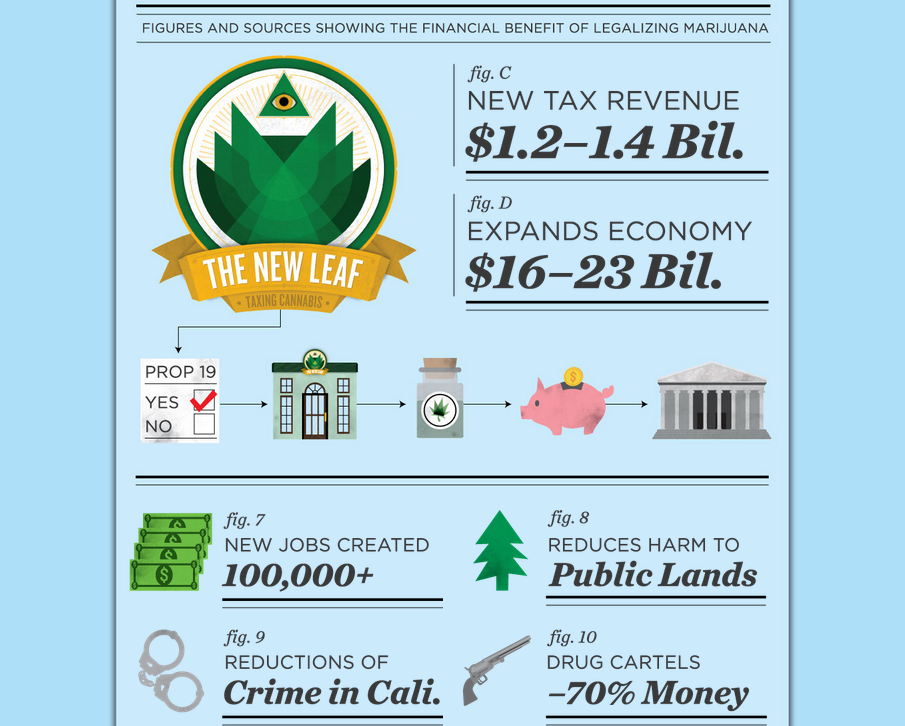
You can see on this prop 14 website about legalising cannabis in America how useful grid systems are and how it makes the website.

We think the vector based style is great so will will probably create our graphics in illustrator. 


http://thenewleaf.org/

The two examples above are from ishothim.com

Really cool website commissioned by Arcade Fire. you enter your postcode and the website includes screen shot areas from your address using google maps. Extremely advanced coding that we are not capable of creating.

http://thewildernessdowntown.com/


http://www.spelltower.com/

We think we can produce a website to this level. This is our target!


When you click on the play button the hand drops and the video player below appears. very fluid responsive. Obviously when the page is resized the graphics arrange themselves accordingly. Another feature we will include.


When your mouse moves across these little graphics the they enlarge slightly, subtle but effective.


We really like the colours this website has used. The idea of splitting the website into coloured slides/ pages. We are going to arrange our website in a similar way but instead of random colours we are going to make the colours reflect the content.


http://www.atlassian.com/

Interactive code that allows the viewer to see how long they have been on the website. This is good because the whole website is about wasting time. The design decisions reflect the context and purpose.


When you scroll the underneath scroll layer changes making the graphic change. This is controlled by the user. We want the user navigating our website to have the choice of how they 'play' with our page. This is a point Yamaha mention in the brief.