Thursday 26 April 2012

COP Publication - Timeline + Medium

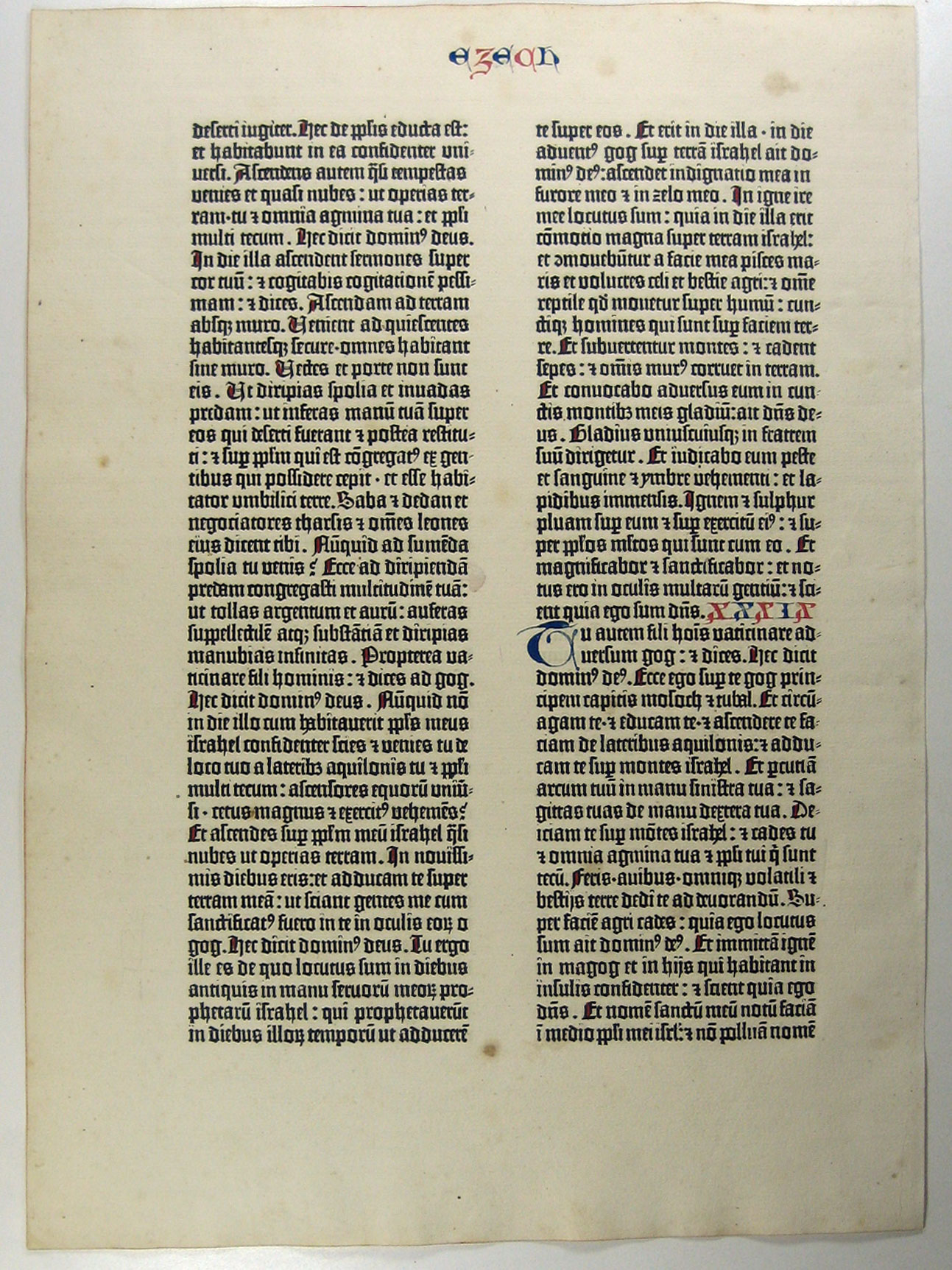
I have decided that I am going to focus on the Gutenberg press and the history of printing. Forgetting about the comparison to the internet. I think by comparing the two inventions/technology it will make my publication too brief.

When researching the internet and how it began the subject really didn't interest me and I found it hard to understand the networking behind it and how the technology actually works. It took me back to ICT in year 11 and I just cant do it.

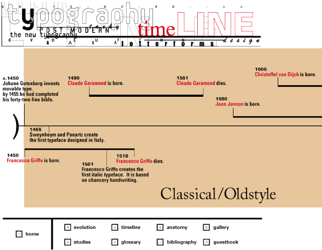
I have begun researching the Gutenberg press and I am going to continue to make a timeline. I am going to cover key dates in printing leading up to the Gutenberg press and then key dates in printing which happened after the Gutenberg press. 

I am going to explain the importance of Johann Gutenberg's invention which made mass production of books possible explaining the technique and why it made the revolution of ideas and technology possible.

Medium
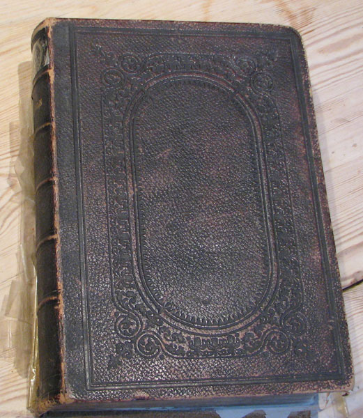
I had an idea today that my publication may take the form of a bible being that the first pressed book was the Gutenberg bible. I need to find an appropriate format for the timeline to exist on. I want a fold out timeline but I need to consider how the page will physically fold out in relation to the rest of the book. I have also been thinking about how to make the book resemble a real bible with enough content to give the book width.


How I Imagine my printing bible to look:
 
Graphic Exchange

  
Taylor Pemberton


Julian Zimmermann


Kate Spade 

Friday 20 April 2012

Type Seminar// Fred

Typeface Terminology


the above was blogged from-  http://www.fontshop.com/glossary/

 History of Type:


Type Classification:
Humanist | Old Style | Transitional | Modern
Slab Serif (Egyptian) | Sans Serif

The Humanist types (sometimes referred to as Venetian) appeared during the 1460s and 1470s, and were modelled not on the dark gothic scripts like textura, but on the lighter, more open forms of the Italian humanist writers. The Humanist types were at the same time the first roman types.

So what makes Humanist, Humanist? What distinguishes it from other styles? What are its main characteristics?
1 Sloping cross-bar on the lowercase “e”;
2 Relatively small x-height;
Humanist characteristics
3 Low contrast between “thick” and “thin” strokes (basically that means that there is little variation in the stroke width);
4 Dark colour (not a reference to colour in the traditional sense, but the overall lightness or darkness of the page). To get a better impression of a page’s colour look at it through half-closed eyes.


Old Style (or Garalde) types start to demonstrate a greater refinement—to a large extent augmented by the steadily improving skills of punchcutters. As a consequence the Old Style types are characterised by greater contrast between thick and thin strokes, and are generally speaking, sharper in appearance, more refined. You can see this, perhaps most notably in the serifs: in Old Style types the serifs on the ascenders are more wedge shaped (figure1.1).
Another major change can be seen in the stress of the letterforms (figure 1.2) to a more perpendicular (upright) position. You may remember our old friend, the lowercase e of the Humanist (Venetian) types, with its distinctive oblique (sloping) crossbar; with Old Style types we witness the quite sudden adoption of a horizontal crossbar (figure 1.3). I spent quite a time trying to discover why the lowercase e should change so dramatically. After searching high and low, and opening just about every type book I own, I decided to post the question on Typophile. Space doesn’t permit to recount the entire tale here, but for those interested in such details, then head on over to the Typophile e crossbar thread. (Thanks to Nick Shinn, David et. al. for their valuable input).

The First Italic Type

And, as we’re on the topic of dramatic changes, during this period we see the very first italic type in 1501. They were first created, not as an accompaniment to the roman, but as a standalone typeface designed for small format or pocket books, where space demanded a more condensed type. The first italic type, then, was conceived as a text face.
Griffo’s contribution to roman type include an improved balance between capitals and lowercase, achieved by cutting the capitals slightly shorter than ascending letters such as b and d, and by slightly reducing the stroke weight of the capitals.
A Short History of the Printed Word, Chappell and Bringhurst, page 92
The Old Style types can be further divided into four categories as in the figure below, and span the roman types from Francesco Griffo to William Caslon I. Unlike the relatively short-lived Humanist faces, the Old Style faces held sway for more than two centuries; a number of them are still popular text faces today.
old style chart 


Transitional Typefaces
Today we’ve moved along the time-line to the cusp of the 18th century, the start of a period in history that we now refer to as the The Enlightenment, a time that was to sow the seeds of revolution in France, North America and beyond. But today we stand in the cobbled streets of 17th century France; Louis XIV is on the throne and Jacques Jaugeon is working on what is now considered to be the first Transitional (or Neoclassical) style typeface, the Romain du Roi or King’s Roman, commissioned by Louis XIV for the Imprimerie Royale in 1692.
Roman du Roi

The Romain du Roi marked a significant departure from the former Old Style types and was much less influenced by handwritten letterforms. Remember, this is the Age of the Enlightenment, marked by resistance to tradition, whether that be art, literature, philosophy, religion, whatever; so it’s no surprise that this same era should give birth to radically different types.

The Romain du Roi is often referred to as Grandjean’s type, but the designs were produced by a committee* set up by the French Academy of Science. One of the committee members, Jacques Jaugeon — at that time better known as a maker of educational board games — in consultation with other members, produced the designs constructed on a 48×48 grid (2,304 squares). The designs — also known as the Paris Scientific Type — were engraved on copper by Louis Simmoneau, and then handed to the punchcutter Grandjean (not to be confused with the earlier Granjon of course), who began cutting the type in 1698. Interestingly, Jaugeon also designed a complimentary sloping roman (often referred to today as an oblique) as an alternative to a true italic**. However, Grandjean himself was to produce the italic from his own designs.

The principal graphic novelty in the ‘Romain du Roi’ is the serif. Its horizontal and unbracketed structure symbolizes a complete break with the humanist calligraphic tradition. Also, the main strokes are thicker and the sub-strokes thinner….Letter Forms, page 23, Stanley Morison

The first book to use these types wasn’t published until a decade later in 1702. In fact the full set of 82 fonts wasn’t completed until half a century later in 1745.

[Baskerville] was not an inventor but a perfector…. He concentrated on spacing. He achieved amplitude not merely by handsome measurement but by letting in the light.—Type, the Secret History of Letters, Simon Loxley, page 54 (quoting from English Printed Books)
“Baskerville has less calligraphic flow than most earlier typefaces”***, and this can be said of just about all the Transitional Style types. Whereas the earlier Humanist and Old Style types owed much to the handwritten letter form, the pen’s influence has all but disappeared in the Transitional types. The following is a detail from one of Baskerville’s type specimens:

Baskerville specimen 


3 Head serifs generally more horizontal:


Thursday 19 April 2012

Arthur C. Clarke// The Internet + Computing


http://www.wimp.com/predictsinternet/

Arthur C. Clarke explaining the future on the personal computer and the effects it might have on society. he got it spot on pretty much. Positive optimistic view.


Arthur C. Clarke:


Quotes:
"Any sufficiently advanced technology is indistinguishable from magic."

"A hundred years ago, the electric telegraph made possible - indeed, inevitable - the United States of America. The communications satellite will make equally inevitable a United Nations of Earth; let us hope that the transition period will not be equally bloody"

Monday 16 April 2012

Social Media & Communication Lecture

The aim:
To engage in current (academic & industry) debates, surrounding the impact of new media on communication and creativity.

Link
-A History of Advertising lecture focus:
-Impact of technological progress of colour     printing the start of creative advertising. 
-Relationship of advertising & newspapers.

 Take away:
-Understand distinctions between mass and new media.
-Understand shifts in aspects of advertising strategy.
-Speculate the implications of New Media on creativity
-Think about impact on the role of the creative
-Create own notes process information

What is new media?
‘…media that work not through persuasion or impressions but through engagement and involvement. If we stick with the old [Mass Media] model, we squander all the possibilities of the new media ecosystem ‘
(Sutherland, 2009)

Rory Sutherland, former president of the IPA and Vice Chairman Ogilvy UK


High Feeling Strategy Today
-Remember Reach Campaign (2010)
-Collaboration AgencyTwoFifteen and AKQA
-Launch film Birth of a Spartan announce Reach Beta.
-Interactive website robot creates light sculpture Spartans
-Each pieced spot represents a person (image)
-3 x films prior and 4th film released after site debut
-Doomed planet (films) 700 million Spartans fight to end
-High-feeling strategy: loss, hope & remembrance
-Break with past: audience involved emotionally, creatively and part of ads
(creativity-online.com, Diaz, 2010)


New Media Model
-Advertising & New Media (Spurgeon, 2008)
-Shift from Mass to My media
-More targeted (mobile)
-Audience involvement:
-(a) voluntarily passing viewing ads (virals)
-(b) creating  spoofs or filming events
-More personalised

Viral; unpaid advertising
One distinction between old & new media
Voluntary viewings (video viewings online)
Forced viewings (TV or Print)
Definition 'unpaid peer-to-peer communication of [provocative] content originating from an identified sponsor using the Internet to persuade or influence an audience  to pass along the content to others’. Southgate, et al, 2010, p350.

New ways of Communicating
Truth Matters Campaign
50,000 Client The independent
James Murdoch news
May elections 2010
Sent to friend
Virals (ads) becoming part of our conversations
BMB after labour account
Entertaining creative = old
New = dialogic
From talk about to talk with


Joseph Kony - Invisible Children
-R4 ICC Congo warlord Lubanga guilty 30yrs
-‘The ICC … first arrest warrant in 2005 … Joseph Kony www.bbc.co.uk (2012)
-March 5th released
-3 days 26 m views. 5th 63 m
-Oprah Winfrey tweet 5th Mar
-9.7m followers
-‘the most successful manipulation of our new media ecosystem to date’ (Naughton, 2012)
NM changing teaching & learning

Conversation Buzz
-Pre –testing propagation
-Indicate (surveys) likelihood to pass on or recommend.
-Dependent on seeding, scale of placement
-Findings by Southgate, et al, 2010
-Hegarty, 5th March 2009 ‘What makes good work Xbox pre-test propagation (viewings & feedback) later banned TV. Viral success.
-T-partay 5.8 m front page news NY Times

Cybernetic communication model
-Cybernetics is the study of systems.
-Can be applied to any system such as mechanical, biological and more complex social systems.


Beattie The Big Creative Idea
-Internet biggest idea since the wheel
-Enables lots of small ideas to circulate
-‘that combination of a trillion little ideas is in itself the biggest idea there is...I think we are at the most interesting point of communications history ever...’ (2010, LCA)
-More is more
-Digital media  convergence opens up opportunities for creatives. E.g Moon 

Viewer-generated content
-Case-study Coke-Mentos
-Viewer-generated advertising worth US$10 million to Mentos ‘more than half its annual advertising budget’ (Spurgeon, 2008, p1)
-New media threatens the top-down communication model
-Audiences are actively managing media culture

Creating a dialogue
-Paul Burns (TBWA) ‘talking with audience’
-40 million
-Old Spice
-Responding to a Tweet
-The making of Old Spice:  copywriter & art director Craig Allen & Erik Kallman W & K
-Tweetedia


10 reasons why this is the best time to be in advertising
-An audience with Sir John Hegarty, 25.3.10
-No. 1 Agencies can innovate e.g NYC tourism campaign
-The idea character of NYC = street culture= street musicians.
-Linked 2 campaigns  'Dig Out Your Soul'. New album tracks released to NYC street musicians to play
-Announcements made websites with Google maps
-Performances video recorded (fans) & uploaded YouTube.
-Caused buzz music press = global
-Creatives collaborated directly with NYC street musicians
TA helped to create & distribute content

 The third screen
-Mobile phones will soon become the greatest tool for persuasion, more so than any other medium for advertising. (Fogg, 2003)
-Fastest growing markets in the creative industries (Mobile Learning  Conference 2009 1st Dec, 2009, London)

In 10 years, virtually the entire media ecosystem has changed...and nowhere is the drive happening any faster...with  the third screen (Precourt, 2009, p1)

Mobile  advertising will become the fastest growing promotional channel
-The world’s most ubiquitous computer
JAR (2009)


 Putting Brands in peoples hands
-Philosophy of Brothers and Sisters
-No Medium is dying e.g. Print
-Media different role in a ‘narrative’
-Traditional ‘announcements’
-Levis Go forth beautifully crafted photography
-Wrangler jeans interactive site like Remember Reach
-NM up-close and tactile
-Craft creatives more important than ever
-Golden age 
Impact of New Media
-Shift from old to old & new media
-Entertainment more enhanced
-Blurring communication, entertainment, education creators, producers, consumers & professional roles
-New models communication, creativity & agencies
-Third layer experiential, engaging, social & tactile
-Golden age of creativity – embrace it.
-New skill-set work collaboratively on and off line
-Creatives LCA Ad, Photo, Fashion, DFGA, Graphics
-Old Media had a beginning. Narrative of New Media open.

Visual Communication // Lecture 13

‘The Rhetoric of the Image’

http://www.aber.ac.uk/media/Documents/S4B/sem06.html
http://98.131.80.43/home/wp-content/uploads/2011/06/barthes_rhetoricofimage.pdf
http://www.scribd.com/doc/13270483/Barthes-ImageMusicText

‘How does meaning get into the image? Where does it end? And if it ends, what is there beyond!’ Roland Barthes ‘The Rhetoric of the Image ‘ in  Image, Music Text 1977 p.32

‘Another difficulty in analysing connotation is that there is no particular analytical language corresponding to the particularity of its signifieds - how are the signifieds of connotation to be named? Roland Barthes  ‘The Rhetoric of the Image ‘ in  Image, Music Text 1977 p.47

This common domain of the signifieds of connotation is that of Ideology, which cannot but be single for a given society and history, no matter what signifiers of connotation it may use.
To the general ideology, that is, correspond signifiers of connotation which are specified according to the chosen substance.  These signifiers will be called connotators and the set of connotators a rhetoric, rhetoric thus appearing as the signifying aspect of ideology.

Communication Theory// Lecture 12

 Lasswell's maxim:
“Who says what to whom in what channel with what effect"