http://www.heathernguyen.ca/
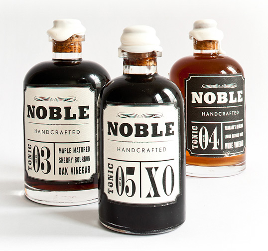
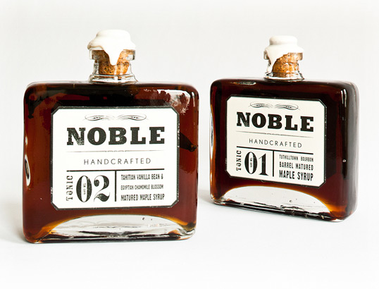
“Nobel Handcrafted is a brand that embraces the collaboration of craft with the pioneering of our new American food tradition, a tradition that is being continually refined.”
Designed by Permafrost | Country: Norway
http://permafrost-news.com/#
I'm just fascinated with graphics on glass or bottles. I think print directly onto the product looks so much neater then on a vinyl. In fact this probably is some kind of clear vinyl but it doesn't look like it.
PostlerFerguson
http://www.postlerferguson.com
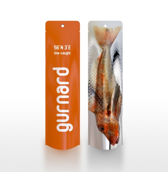
This is a rad design and I would probably buy it just for it to stay in my fridge on show; I think that real fish enthusiasts and sea food connoisseur may be put off as they cant see the fish. I know my dad who's a chef like to browse the seafood and have a good look and thoroughly examine the fish before he's purchasing anything. Just a thought.
PF's website is pretty neat to. Love the primary colours on the website.
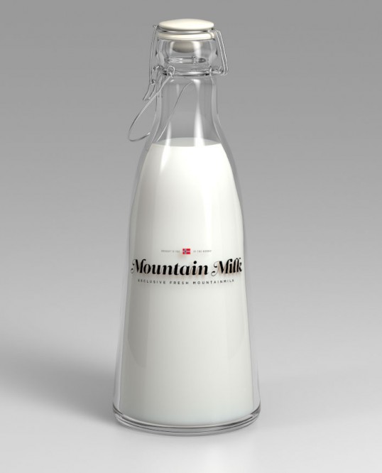
Designed by Anders Drage | Country: Norway
http://dribbble.com/andersdrage
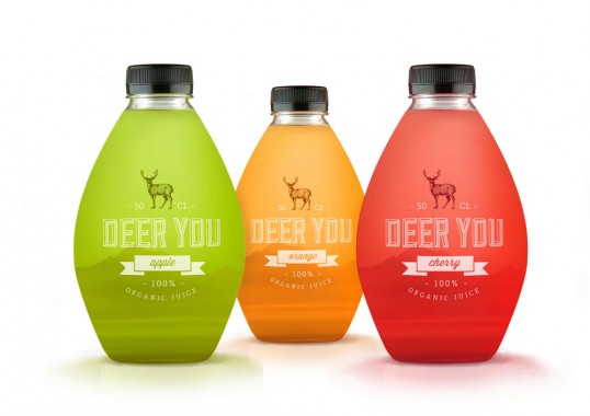
Designed by Mara Rodriguez | Country: United States
http://i-m.co/oloramara/oloramara/packaging
"The brand as an stamp, tries to give quality to the product, but with a nowadays style, cause we don’t want it to be an old fashion juice. Also the mountains on the background gives to Deer You Organic Juice a different and attractive feeling. The bottle tries to represent a canteen bottle, which people used to carry to adventure trips, or to a cabin in the middle of nowhere, so it help us to transport our minds to a fresher air place.”
Kevin Angeloni
"Another way of seeing the gray pencil that everyone knows and is an indispensable tool for all creatives. The pencil is contained in a thin glass cylinder topped with a cork. Everything is placed in a plexiglass holder."Cool but I see it as a lot of unnecessary packaging.






No comments:
Post a Comment