Print products
By ACRE
"PACT is an open space where partnerships between like-minded businesses are housed. The clients’ different backgrounds in hairstyling, food and fashion, challenged the agency to create distinction amidst homogenising the brand experience. We first went about designing a unifying element with the use of the ampersand (&) symbol, altering its structure to spell “PACT”. The ampersand celebrates partnerships and is positive about the likelihood of future collaborations. The design execution of marbling was chosen to depict three dissimilar businesses coming together to form a single-minded entity. The swirls and mix of marbling underlines the brand’s reflexive yet determined vision of celebrating partnerships."This branding is beautiful by acre. I think the photography will make or break product shots like this when the purpose is for people to view work online. When I view work and like it it is generally because of the design, but if it has been badly presented it really does spoil it for me. It gives your work something to identify with, something a little more iconic. The pink background below for example set ACRE work apart in my from other work that has been photographed on white back drops.
Sissy's Southern Kitchen
Tractorbeam™- USA
www.tractorbeam.com/
FOCUS: Packaging, Design, Branding
Another example of this work by Tractorbeam; what is going on with these animals in the product shots? I have no idea it intrigues me and grabbed my attention.
Really like the yellow edges on the business card. I will try some experimentation with this.
Tokidoki
Art Direction, Branding
by Miguel Ángel Salido
Breadth of product range designed here. I really like the theme of the restaurant and the portrait photography does it for me.
Posto - Branding
By Oat
Somerville, MA, USA
oatcreative.com
FOCUS: Art Direction, Branding, Graphic Design
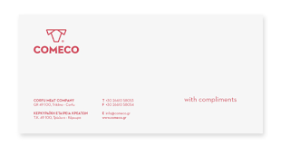
COMECO // Corfu Meat Company
Branding, Graphic Design, Print Design
Creative Director
Chris Trivizas | Design
Athens, Greece
www.christrivizas.gr
FOCUS: Packaging, Branding, Graphic Design
Probably one of my favourite branding projects on Behance. I like this because Comeco showed the design process of the logo which I thought was interesting.
Probably one of my favourite branding projects on Behance. I like this because Comeco showed the design process of the logo which I thought was interesting.
Pretty sure this is a digital mock up. Appropriate as it just looks visually better as a mock up rather then a printed letterhead and envelope photographed.
This was really nice to see, interesting to see how other people design logos.


No comments:
Post a Comment