http://superbigcreative.com
They have photographed the products really well which makes such a difference when people are viewing the work online. It can make good work look bad and bad work look good!
I am going to make sure my products are well photographed to really show off what I am going to do.
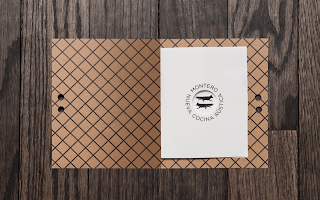
Nice stamp. Makes the menu look as if its important, official.
www.fastcodesign.com
I will do a window mock up at some point. I am interested in Letterset especially on glass. I could do some typography work for a concept shop window.
Branding for El montero restaurant by Anagrama
I would like to set up a mock restaurant but there isn't really anywhere I could do this without having a restaurant of my own. I could go to an existing restaurant but I think it would be difficult to make an existing restaurant look like the re-brand for Mutton Quad.
Again the reason why this project stood out to me is because of the sweet photography used to document the work Anagrama did.
Birds eye view is a good way of showing the range of products you have created.
Little Saigon
by Bratus , JIMMI TUAN

I like how they have shown the grid and guides they used. It's interesting seeing the work process of other creatives and designers.
Again well presentated. Looks well lit.
The Room Service
Corporate identity for a restaurant in Barcelona
Project developed in cooperation with Mayra Monobe.
Really like the simplicity and sophistication of the laid out menu.
BERG
by Design + Konzeption
Stuttgart, Germany
www.lsdk.de
The colour makes this work stand out when you're looking for examples of branding which is something to consider.
The work is really precisely laid out for the photographed final.


No comments:
Post a Comment